Conversion optimization is a crucial aspect of improving your app’s organic strength, and now with iOS 15, it is time to shift our focus on Product Page Optimization and discuss how to prepare for the upcoming changes.
Organic mobile user acquisition can be thought of in two steps. First, you have to be discovered by users and drive them to your app listing. Second, you should have a product page that convinces those users to download your app.
Native A/B testing is nothing new for Google Play Store. However, iOS app marketers were handling it mostly with third-party tools. Later this fall, Apple will launch Product Page Optimization for improving organic conversions. With this new feature, we will be able to do native testing in the Apple App Store.
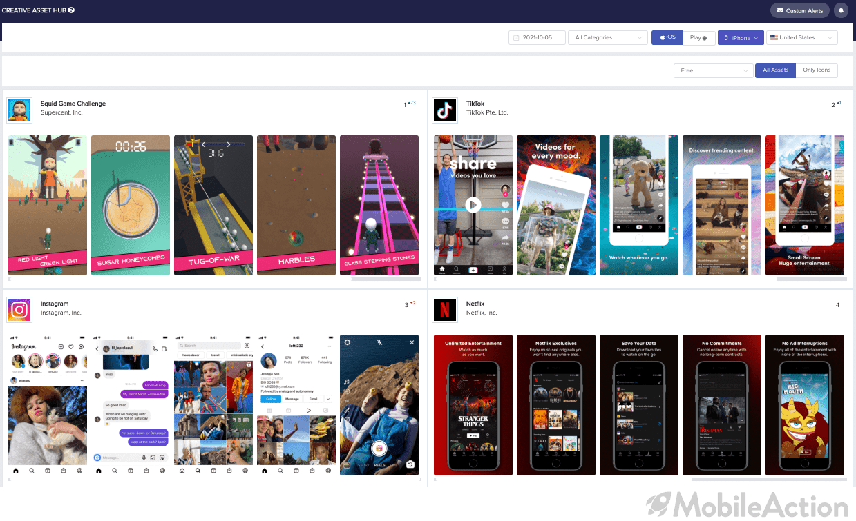
The elements such as app icons, app previews, and screenshots play a huge role in the user’s decision-making process. In this sense, it is crucial to find the best combination of them to increase conversion rates.
So, let’s talk about how you should approach Product Page Optimization to get ready for the changes.
Basics of iOS 15 Product Page Optimization
Let’s begin by talking about what you can do with this new feature.
First and foremost, Product Page Optimization is for organic traffic. Meaning that you are going to deal with users that find your app in the search results or by browsing through the app store. For paid traffic, Custom Product Pages will be used to present different assets to users depending on the user acquisition channel they came from.

So what creative elements can you test with Product Page Optimization? The new feature will allow you to test your app icon, screenshots, and video previews. However, you won’t be able to test other elements such as description or app title.
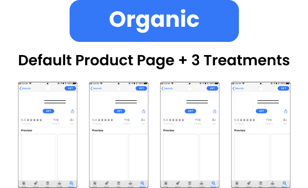
You can have up to three variations of your product page. After running your tests, you can decide on the more effective product page and set it as default.
How will Product Page Optimization Work?
With Product Page Optimization, you will be able to direct the organic traffic. What does this mean?
For instance, you can direct 70% of the organic traffic to the default product page and 10% to each variant. As mentioned above, you will have up to three variants. This way you will be able to monitor the performance metrics of each product page.
Assume that you want to test your app icon. Without changing the video previews and screenshots, you can implement a different app icon. In this way, you can monitor its performance. Or you can apply the same process for screenshots and video previews by maintaining the other two.
You should know that all the changes will go through the standard review process. Once they are approved, you can also control the amount of traffic for them. Or you can test variants for specific regions.
You may want to increase your conversion rates in Japan. So, you can form a product page specifically for Japan and test it only in Japan. In this way, your optimization efforts won’t get blurred and you can make better decisions.
Obtaining Reliable Results with Product Page Optimization
If you don’t build a solid decision-making process for this feature, you might not be able to reap the benefits. What do we mean?
As humans, we tend to jump to conclusions or interpret results in a way that favors our cognitive processes. When working with data, it is essential to keep these biases at a minimum level.
There are a few practices you can follow in order to get healthier results from your A/B testing efforts.

Tips
- Be Ready for the Changes:
Don’t wait for these changes to become available. Start building your strategy. Analyze the market. Form a hypothesis. Prepare your assets. Decide on your goals and expectations.
Don’t get ready when the race has already started. Be ready to run.
- Collect Sufficient Data:
Don’t stop testing until you trust the results. For instance, you run the test for a while and you see the results inclined to your expectations. If you stop the test when this happens, your data won’t be credible. As a result, when you apply the changes to your product page, you will not observe a significant difference. Apple will allow you to run tests for 90 days. Be sure to benefit from it.
- Focus on your Hypothesis:
Don’t rush and don’t bombard the native testing.
Meaning that if you have an idea about your creative assets, take a deep breath and calm down. Don’t run tests on all of them at once. If you do not define the boundaries of your test clearly, it will not be possible to interpret the results accurately. Was the app icon that increased the conversion or was it the screenshots?
- Localize your Creatives:
Don’t just translate. Localize.
Different regions have different cultures. What’s good for one region can be bad for another. Adapt your product page into those cultures.
- Adjust your Variants Well:
Preparing tests is not easy work.
You may fail to form variants that differ from others. As a result, you may not have a winning variant that you will direct the whole traffic to.
None of us would want to spend that much time and face a negative outcome. However, without a solid strategy and resourceful teams, errors can easily occur.
How It Will Improve Your Conversions
How important can the background color on your screenshot be? Can a tiny app icon impact your conversion rates?. When you think about mobile user acquisition, you always need to consider the volume of audience you are working with.
If you take 2 strangers and ask them about their preferences, they might also think that these details will not have a major impact on your user acquisition strategy. But when you extend your data set to tens of thousands of people, it is possible to find consistent patterns across user behavior.
When users search for a keyword that your app gets listed, they will encounter your app icon probably prior to any other aspect of your product page. It might attract or push them away. Therefore, it is of utmost importance that you create an app icon that is loved by users. And of course, the best way to do it is to run A/B tests.
The next place that users will look is your screenshots and video previews. They want to get quick information about your app. What features does your app offer and how is the app display? If you fail to explain your features smoothly with your screenshots and video previews, you will miss out on fruitful users.

So the best thing to do is to optimize them by considering their performance. How does the font on my screenshots impact conversions? Which background color on the app icon is more effective? What is the optimal duration for app previews?
In short, you can improve the performance of your creative assets by better understanding consumer behavior. Once you understand your audience better, you can respond better to their demands.
Successful tests come with accurate insights. Schedule a demo now and see how our tools can help you get the most out of the new features of iOS 15 user acquisition.


