We have recently been introduced to a digital medium of exchange that is decentralized and beyond the control of governments. This emerging development ushered in a new age where the basis of the economy was redefined. And of course, the mobile app industry got adjusted to it pretty quickly. As you can see, the best finance apps are all revolving around the subject of cryptocurrency.
We are not experts who can point to the next golden opportunity of the crypto market. However, on app marketing and mobile user acquisition strategies, we come in useful.
Let’s begin by comparing how finance apps approach app stores. Then we are going to dive into the user acquisition Strategies of Binomo and Coinbase.
A Comparison on Finance Apps: Google Play vs App Store
As you can see, the top 10 advertising apps in the finance category differ from Google Play to App Store. There are only five apps that rank among the top advertising finance apps in both app stores: Crypto.com, IQ Option, Coinbase, Kraken, and Olymp Trade.
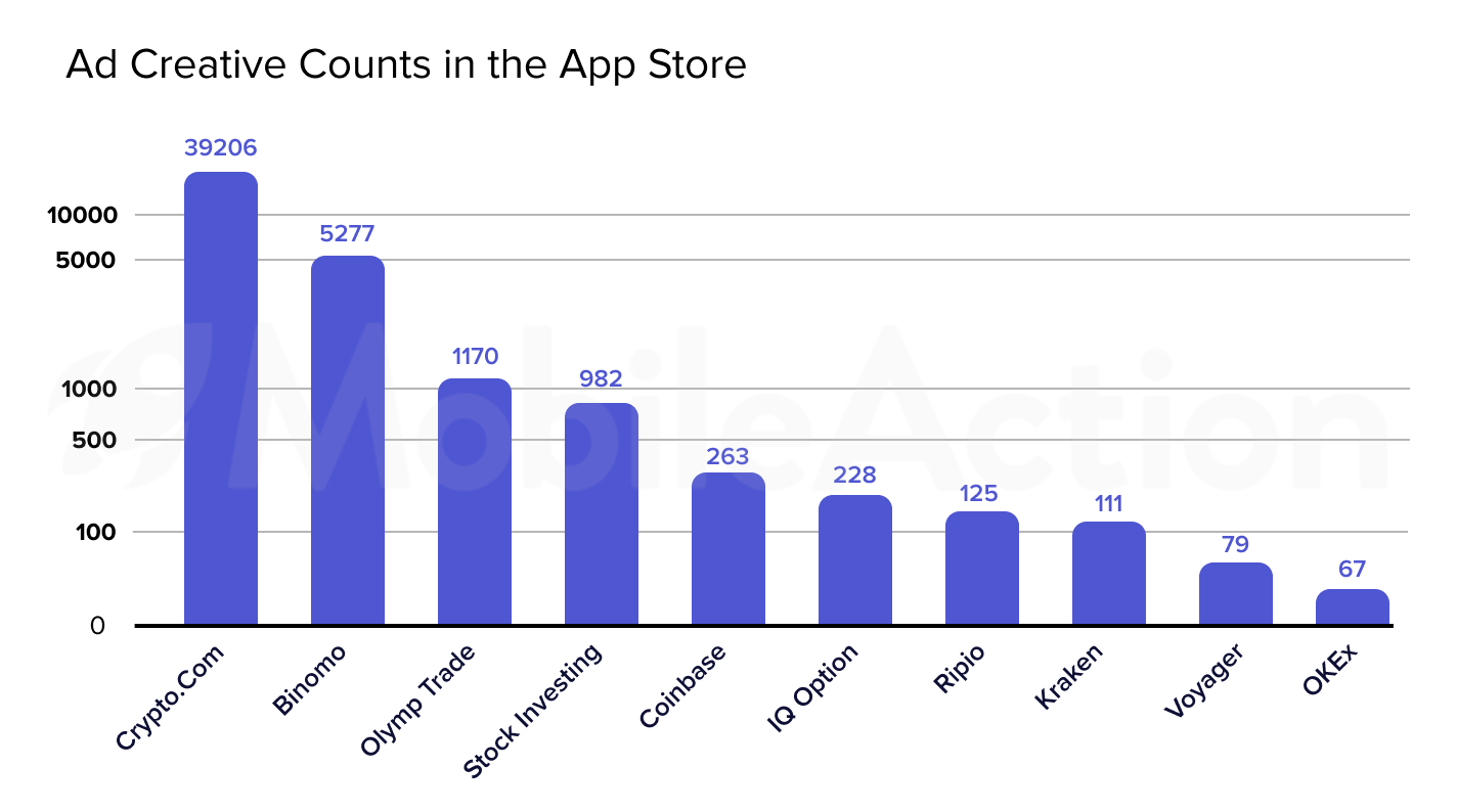
When we look at the apps based on their use of unique ad creatives in the App Store, we see a huge difference between apps. Crypto.com ranks first and utilizes ad creatives almost 8 times more than its closest follower. This gap gets bigger as we move on to lower ranks. OKEx used only 67 unique ad creatives in the last month.
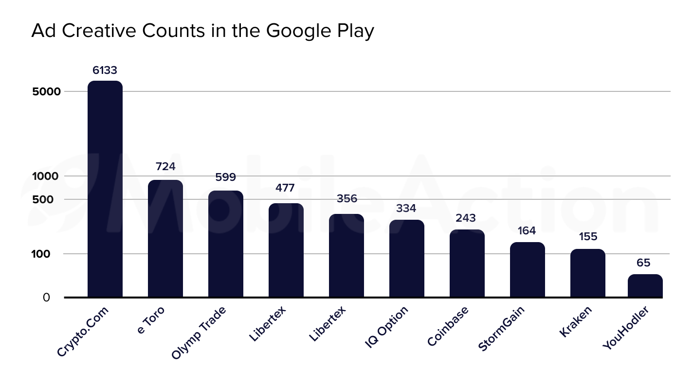
Apps seem to have a closer competition in Google Play since the difference between their use of ad creatives isn’t as significant as in the App Store. Crypto.com leads the crowd also in Google Play but with lesser unique ad creatives. We also see a decrease in ad creative counts of Olymp Trade and Coinbase.
Given these circumstances, it is clear that apps run more unique ad creatives in the App Store than Google Play.
Now, let’s take a closer look at the paid user acquisition strategies and ad creatives of the best finance apps.
Binomo
Binomo is the third top advertiser in the App Store’s finance category. They operate only in 19 countries leaving the US, UK, and most of the European countries out. Moreover, only 5 languages are used in the CTO, subtitle, and body of their ad creatives.

It can be seen as a bizarre situation since left-out countries are some of the biggest app markets. However, having a focused ad campaign has some benefits, too.
For instance, they can produce better ad creatives by tailoring them to the behavior and preferences of the target audience.

Here, we see their ad networks, ad publisher counts, creative counts, and format distributions in India. As you can see, Mopub is the ad network with the most ad creatives for Binomo, and in these ad creatives, Binomo prefers the Html format the most by far.

And here, we see the same data for Turkey. They work with Unity by a large margin in Turkey and they prefer video format the most.
As our Ad Intelligence shows, Binomo has two very different approaches in India and Turkey. But why is Binomo doing this, right? Because different audiences have different demands and you cannot attract them all with the same treatment.
Now, let’s see how they maintain this ad strategy in their ad creatives.
Ad Creatives Analysis for Binomo
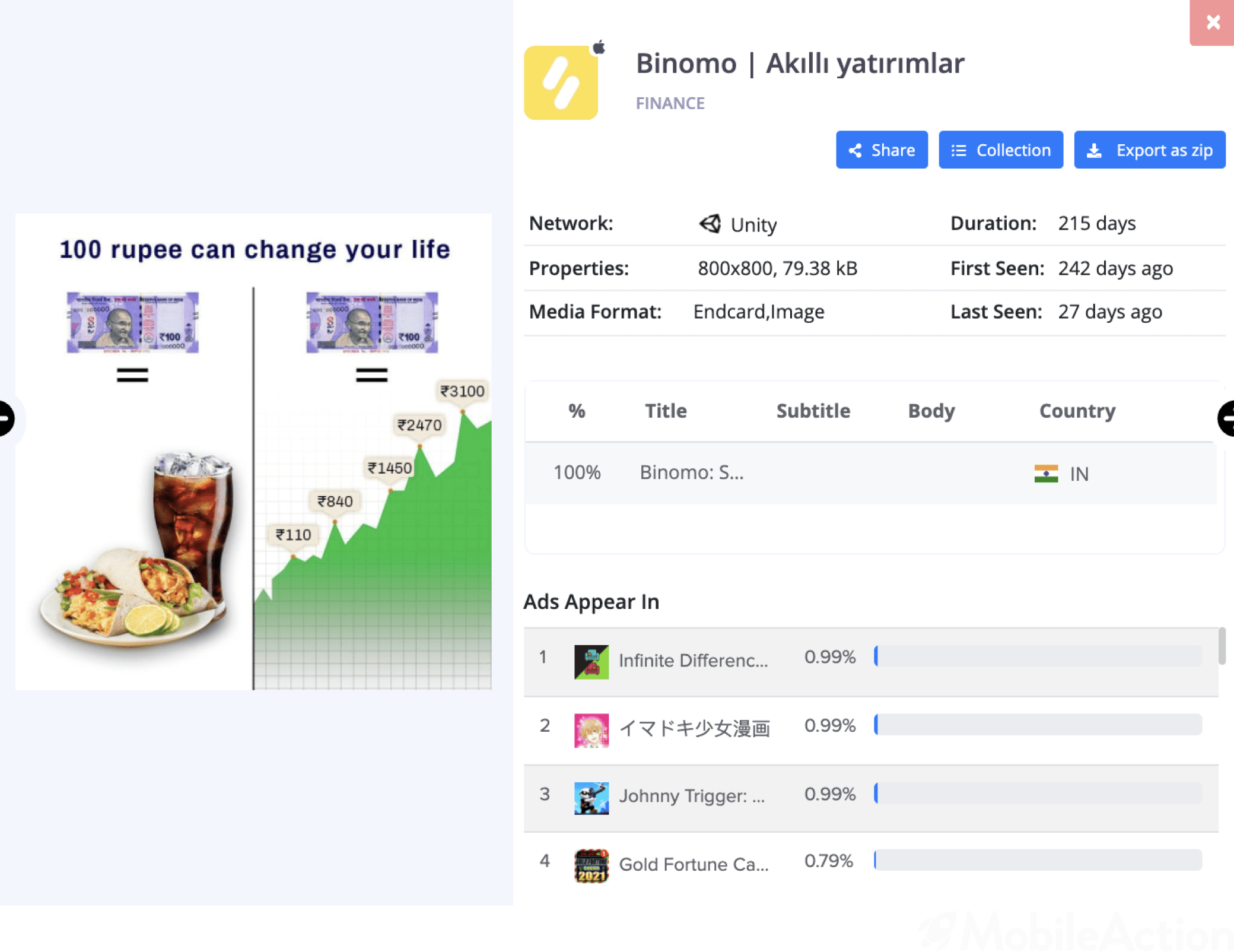
With this ad creative, Binomo wants to attract users by saying you can either spend money or make money. Moreover, It is obvious that this ad creative specifically targets Indian users because it says 100 Rupee in it. It communicates on a deeper level with the Indian audience as it uses elements specific to India. Therefore, it can generate better results.
This is another great example that shows their focused approach. As you can see, It uses a banner that says “for India Only”. Meaning that they don’t only localize their CTO, subtitle, and body of their ad creatives but also their contents.
Here, we have an ad creative for their Turkey campaign. Just like they do in India, they tailor the content for Turkey, simply by adding the national currency in the video.
This video serves the same purpose as its Indian version, the content is almost the same. However, Binomo localizes everything in this video, making it specialized for the Turkish audience.
Their smart marketing does not only carry them among the best finance apps but also helps them maximize their click-through rates and therefore their growth.
Coinbase
Now, let’s continue with the #2 of Google Play’s top advertiser finance apps.

Facebook has 39% of their total ad creatives, which is a large share by itself alone. However, Coinbase also distributes %16 of their ad creatives to Instagram, Messenger, FB Native, and Youtube. Meaning that they attach great importance to social media channels in their mobile ad campaigns.

However, when we look at the impressions they get from these mobile ad creatives, we see the social media channels fall behind. Although Admob has only 35% of their total ad creatives, 68% of their total impressions came from Admob in the last month.

Their ad campaigns are active in 50 countries and they have a more balanced distribution than Binomo. The United States gets the biggest share with %10.85 and the other countries’ shares vary between .5% to 3%. However, we see that their ad creatives are mainly in English.
Targeting a larger audience from different countries is nice but not localizing your ad creatives is not. Because even though you have ad creatives for them, you won’t be able to create the impact you want. In this sense, localization is not an option but a must.
Nevertheless, it should be stated that they have really engaging ad creatives. Coinbase runs ad creatives that successfully explain the value propositions of the app. Moreover, they are utilizing different types of video content to attract users, such as app reviews from users or comparisons with other exchanges.
Now let’s take a closer look at their ad creatives.
Ad Creative Analysis for Coinbase
Here, Coinbase explains why users should prefer them instead of other exchanges. The video explains they are secure, regulated, and easy to use in a simple and clear manner. While Coinbase is on the blue side, other exchanges appear on the black surface. As known, blue represents peace, security, and reliability in color marketing. And this is exactly how a finance app wants to be seen.
In this video, they feature a review from a real person who explains why she thinks Coinbase is perfect for crypto. These kinds of videos support your marketing goals as they increase the trustworthiness of your app by providing social proof.
A finance app can offer many features. You can buy and sell stocks, pay your bills or follow the news in the market. While advertising your app, it is always better to talk about every feature you offer. In this way, you can show what separates you from the rest.
Here, Coinbase provides information about how its users can make money by watching videos and learning about crypto. This allows them to diversify their ad inventory and emphasize other functionalities of their app.
Throughout the post, you saw how our mobile Ad Intelligence tools can uncover every aspect of the paid user acquisition strategies of the best finance apps. If you also want to improve your marketing game and rank among the best, schedule a demo with our experts now!

